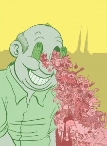
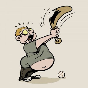
This is likely to be the last Prairie Dog I do before I make the move to Vermont and begin classes at the Center for Cartoon Studies. Time allowing, I’d still like to do stuff for Prairie Dog while I’m away, but it will probably be less frequent.
This was a fun cover to work on because the editor wanted everything to be hand-drawn, including all the text and the Prairie Dog flag itself.
Sadly I fucked up everything with a lower-case ‘e’ by somehow managing to forget the ‘e’ ‘Sainte-Marie. I fixed it in the image below to pad my bruised, oozing, comatose ego.
This completely kills this cover for me for three reasons:
- Proper spelling banishes evil spirits to the land of hungry ghosts.
- My parents named me Dakota because they liked Buffy Sainte-Marie, and she named her son Dakota … I feel like I should know that shit.
- A girl who liked my comics used to email me wanting to hang out and she spelled my name ‘Dakoda’ every single time. It drove me crazy, and many evil hungry ghosts snuck through the veil of the living during those dark days, let me tell you.
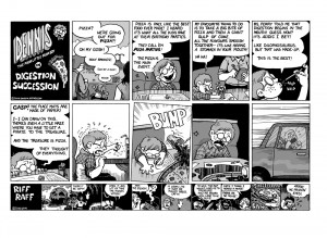
Anyway, also included in this issue is a new Dennis: The Poor Little Poor Boy strip, which can be found on the Dennis page.
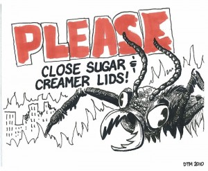
Don’t Feed the Ants
Someone in the office asked me to make a sign reminding staff to keep the lid on the sugar and creamer.
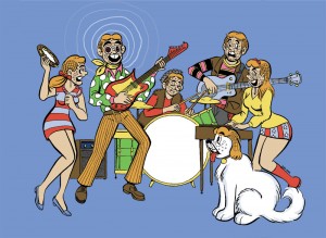
This parody image was done for Planet S magazine’s music issue.
Does anyone remember that Archie I comic where they’re all cavemen, and Betty & Veronica start naming everything? When they give Archie his name he sings, “I’m an Archie, you’re an Archie, everyone’s a starchy-Archie! Don’t you want to be an Archie too?”
I like the caveman one where they discover fruit better though. Those crazy cave kids. They thought fruit was for some kind of game until Jughead accidentally got a peeled banana right in the mouth.
Anyway, I always wondered why Reggie would ever a join The Archies band. I mean, they don’t call him “I-love-me-Mantle” for nothing.
I was kept busy last weekend with a cover for Planet S magazine, and a comic for Prairie Dog.
The magazines were celebrating the best food and drink in Regina and Saskatoon.
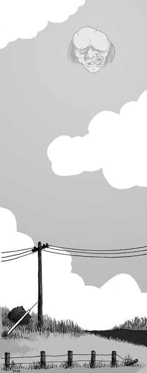
Illustration for Broken Pencil
This illustration is in the current issue of Broken Pencil Magazine.
It was for a short story called “Texas Bound” by J Jack Unrau.
The story may or may not be about the narrator awaking at the side of a road to discover David Lynch, or a Lynch look-alike watching the narrator and masturbating.
This means that I have a sketch of David Lynch masturbating in my studio, which I didn’t end up using.
Instead I drew a landscape with the Elephant Man.
Maybe next time, David Lynch. Maybe next time…
How Not to Draw a Poster
Ahhh, rejection.
Rejection always brings up a range of emotions and thoughts; plummeting sense of self-worth, frantic doubting of one’s abilities and knowledge, questioning the critical worth of the rejector, elaborate revenge scenarios, and eventually begrudging (if not cheerful) acceptance.
The Cathedral Village Arts Festival in Regina decided to do something different with their posters this year. They hired two artists to design posters, with the intent of paying the winning artist more money.
Of course, most artists are always convinced that they can catch that delicious-looking carrot being dangled from the end of a fishing rod.
Needless to say, I felt the stinging kiss of rejection with this poster. The theme for this year’s festival is “Doors to the Imagination”.
First there was controversy over my use of knock-off cartoon characters. An argument which later turned out to be a non-issue red-herring.
Eventually the CVAF committee decided that they simply didn’t like my poster.
Oh well, you can’t win them all. I haven’t yet seen the poster that was chosen (nor do I know who the other artist is), but my excitement to see it is a perverse mixture of competitiveness and genuine enthusiasm.
Incidentally, the CVAF committee said that they might still want to use my illustration for promotional material (i.e., for the Comic Jam).
I’ll taste that sweet, fresh carrot yet…
It’s been a while since I’ve posted something other than daily comics, so I decided to break that trend tonight.
The new year has brought me a few new cover-gigs with Prairie Dog and Planet S. Note Prairie Dog’s spiffy new website!
I enjoy doing this stuff because I don’t have a lot of time for my own comics at the moment. I’m still working a full-time job until I make my trek to the Center for Cartoon Studies this fall (Note CCS’s spiffy new website!).
These covers make me feel like I’m still active as an artist … or at least an illustrator.
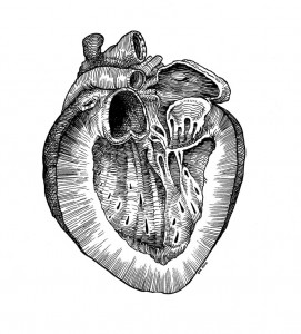
The editor overlord asked me to draw a dissected heart with lots of cross-hatching reminiscent of the drawings Andreas Vesalius. But honestly, I wasn’t really listening after he said ‘lots of cross-hatching’. I don’t cross hatch as much as I used to, but I still really enjoy it when situations call for it.
No, that’s an understatement. I love cross-hatching. Cross hatching takes me back to my late teens when I was first exposed to Robert Crumb’s work. I have a lot of happy memories of drawing comics until four in the morning, trying to hatch like Crumb.
Anyway, Prairie Dog’s new graphic designer worked the image into the cover:
If you can guess to which species of animal it belongs, you will win … well, nothing. I don’t have anything you would want. But still, guess away!
The next cover was for International Women’s Day. Editor overlord wanted an image of Rosie the Riveter, updated for today, with doodle-art style tattoos that reference the 60s/70s feminist movement.
I’m not totally satisfied with the results, but it’s mostly due to small things like the figure’s line of action. The original image of Rosie the Riveter has a dynamic angle in her pose. I had to dampen it a bit so that the tiny men-relieved-by-feminism wouldn’t look cluttered. The finished product lacks some of the oomph of the original. Also, I didn’t really capture that defiant look in her eyes.
That’s all for this week. I’m going to be doing another Prairie Dog cover for next week … which may or may not be Hawksley Workman. We’ll see!
And if you’re really lucky (or rather, if I get off my ass, and onto an ass equipped with a computer), I’ll post my special Valentine’s Day comic that appeared in Prairie Dog.
Lovely to lovingly love your love…
Here are a few more covers I’ve done for Prairie Dog in Regina.
The first was used for the Regina Folk Fest issue. Unfortunately, there are a lot of problems with this image. Like the fact that the fretboard doesn’t reach the sound hole. Or the fact that her one of her feet is messed up. I might as well have put her thumbs on the wrong side. Gah! I was so young and naive all those months ago.
Joni Mitchell/ Janis Joplin mashup
Next we have an illustration I did for an issue focusing on Saskatchewan’s potentially nuclear future, featuring a radioactive-blue, mutant prairie dog thing. I learned a lot about chain link fences with this drawing … mainly that they take forever to draw.
How does it 'make'?
Finally, here is the most recent cover art: the ABCs of scary halloween monsters. I tried to imitate the flat, dry-brush paintings in old Little Golden Books like The Saggy Baggy Elephant – but I think I’m going to need a lot more practice. If you can guess what the thing under Q is, it’s a warp zone full of bonus points.
Try to guess them all!
That’s all for now. I’ll post some more junk soon.
The problem with me having a blog is that I forget that I have a blog. Consequently, my blog does not get updated.
But no more! Today I will begin making posts on a regular basis! Today I am a changed man!
For starters, I thought I’d post some of the illustrations I’ve done for Prairie Dog magazine in Regina.
After losing my weekly strip in the Leader-Post, I started seeking out other venues. I sent stuff to magazines across Canada (and even a couple from the USA) … but the only ones who even responded were from Regina. I guess I’m invisible everywhere but home … or maybe I don’t exist anywhere but home. Hm.
Anyway, I approached the Prairie Dog with the idea of doing a regular strip for them. Prairie Dog is pretty ‘with it’, so I figured the staff and readership are probably more aware of the same ephemera that draws my attention.
Sadly, they also don’t have a lot of money. And they need space for those sweet money-making advertisements. So, there are no comics.
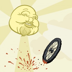
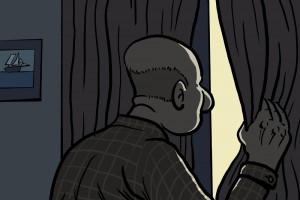
On the plus side, they have asked me to do a few covers and illustrations. The three above were done for an article focusing on fun things to do in the summer:
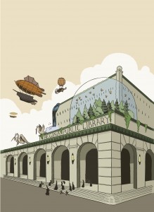
The first cover I did for them was for an issue that responded to the proposed redesign of the Public Library’s Central Branch. The concept was for the cover to depict the best library ever made.
At the time I was frequently visiting paleofuture.com, a blog the highlights what past generations believed the future would look like.
My favorite predictions of the future come from the late 19th century. Everything is a zeppelin! Even things that don’t need to be zeppelins, like coffee tables and barber’s chairs – for some reason everything has a set of propellers and/or a balloon.
I’ll leave it at that for now. More posts in the near future!

